

Colors Trends for Kitchens
Everyone loves a crisp white kitchen and you can’t escape this look when admiring kitchen designs on Instagram and Pinterest. And while I can still appreciate that crisp white look, we love it when a client comes to us wanting to explore a bolder direction. I’m known for my use of color, and I love a kitchen with flavor that departs from this current trend. Color is a strong design element that can completely change the atmosphere of your interior. When building a home or doing renovations, it’s essential to conceptualize what type of ambiance you want to be welcomed into your home. The kitchen space is one of the most utilized comfort areas, so color choice and placement can make all the difference!
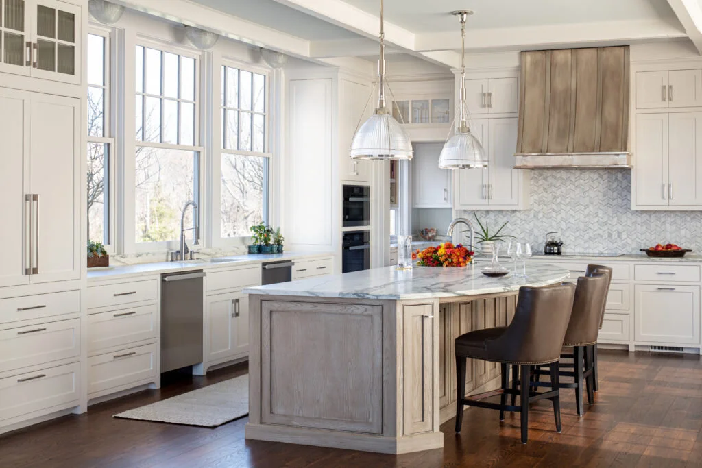
When it comes to color, cabinet space is the biggest canvas. Taking up much of the walls in the kitchen, there is plenty of room to get creative. A lighter shade of blue is a great color option for creating a clean, crisp appeal. I love the french blue tone of these cabinets blended with the rich walnut stained island to help ground the space.


Invite Color Into Your Kitchen and Other Adjoining Spaces!
Dark blues and darker neutral shades work great when complemented with white or light-colored accents throughout the kitchen. Sometimes clients are afraid to make that big of a commitment in their primary kitchen. So, we talk them into going a little more bold in their adjoining spaces. In this new construction project, the kitchen is primarily white, but my clients were willing to go a little more bold in the adjacent bar area. I love the navy cabinetry with the gorgeous quartzite countertops and marble backsplash. The navy pulls in the colors from other nearby rooms and gives this bar some real personality.


In another new construction project, my client wasn’t afraid to go bold in her gorgeous pantry. In addition to the charcoal gray cabinets, we embraced some bold color and pattern on the walls in the form of this classic Schumacher Chiang Mai wallpaper. I would love to have this pantry! I told my client that I would add a great chaise lounge in the middle and call it the Mommy’s Time Out room!


Ways to Make White Kitchens Sing
Still love a white kitchen, but want to dip your toes into adding a bit more drama? Mix it up! We loved mixing colors in this project for a client. Get the best of both worlds by having white cabinets on your uppers, but another color on your base cabinets. This is the primary kitchen off the fun pantry I shared above, so our base cabinets repeat the dark charcoal color that we used in the pantry. I love this mixed look.


Pop it with Some Bold or Warm Accents
Accents are another great way to elevate the color play by incorporating subtle but impactful details. We took the concept of an all-white kitchen with these projects and created a pop of color by utilizing a colorful reverse painted glass tile as the backsplash. These bold teal colors in the tile are carried over into adjacent rooms to help create a great flow for the kitchen area.

Another big trend in white kitchens is the incorporation of brass and gold. In this kitchen, we incorporated brass light fixtures and hardware along with a glimmery gold backsplash tile to add a lot of great warmth to this white kitchen. We also installed a beautiful blue grass cloth wallpaper in the back of the glass cabinets to add a little more pop of color. This wallpaper is a great backdrop to our clients’ white and gold china that we highlighted in those glass cabinets.

Mix it with a Stained Island
An all-white kitchen can feel a bit cold, so I like to break up the white with a little wood. In our Charlottesville new build project, we incorporated a beautiful, limed oak island in a natural stain. This still allowed us to keep the island bright and light, but the texture of the island provided some warmth in contrast to the perimeter cabinetry. This kitchen won us a first runner-up nod for the 2021 NKBA Kitchen Design Awards. It’s definitely one of my favorite kitchens!
We warmed up a more traditional classic white kitchen renovation for a client with a gorgeous mahogany stained island. This client has a home full of beautiful rich antique pieces and traditional furnishings, so the stained island was a great way to blend this kitchen with the rest of their home while still keeping it light and bright.

Bringing the Magic Home
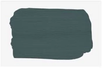
Another current kitchen project we are excited to be working on is for my very own home! For this personal project, the custom cabinets will be painted Sherwin Williams Still Water with warm cherry accents. The Still Water color is a great way to bring in the blues and greens from our lakefront property. The natural cherry complements the mid-century vibe that I’m embracing in our swinging 70s split level, as I’ve come to call it lovingly. With all the magic currently happening, we know this home will turn out beautiful – and full of color!
As we’re marching into the depths of fall, we encourage you to take in all the inspiration from the colorful seasonal changes happening around us by bringing color into your home. A little color goes a long way, and the kitchen space is the perfect place to let the creativity flow. We’ve certainly taken up the challenge with our current projects and hope you’re feeling the inspiration too.

How To Work With Color In Your Living Spaces
Colorful interiors require a little bravery and skill to create a cohesive inspiring look. Jennifer Stoner highlights one of her favorite projects where she injects bold shades of teal and purple throughout. She shares some easy tips to create a colorful space in your own home with some simple tricks.
We recently finished a great project at a lakeside home in Powhatan, Virginia for a family of eight. This was such a fun one to work on because my clients embrace vibrant interiors as much as I do. When they purchased this home by the lake, they decided that none of their more formal European furniture from their previous home worked well, so they needed to start from scratch. We decided to set the tone for the entire house as soon as you step into the front door with this bold wallpaper in the foyer.

Most of our clients opt for more neutral upholstery pieces in their living rooms because they’re afraid to commit to a bold color. But In this case, we started our design process with the selection of a gorgeous teal leather tufted sofa. We then found the beautiful hand knotted rug that pulled in so many other fun colors to work with.
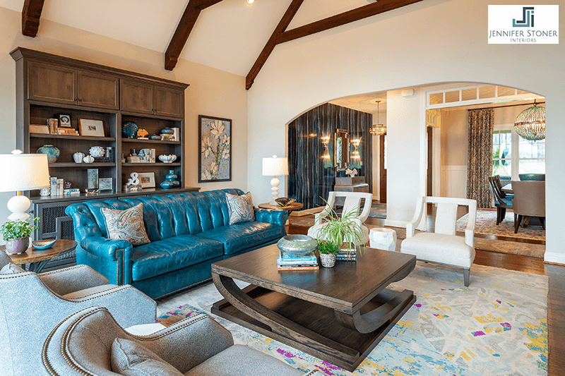
The key to working with bold colors in a living space is to balance it with softer neutral tones. In this case, we kept the walls light and brought in the ivory chairs and marble accent tables.

To further balance the scale of these soaring ceilings, we added the custom cabinetry at the back of the room. The bases of these cabinets were specially designed for the furry members of their family.

With a family of eight, my clients decided to finish the basement to create more living space for their large family. We were able to create two distinct living areas, a small kitchen and dining space, a second master suite with a full bath and two walk-in closets, a playroom and a full size pool bath out of the almost 2700 square feet of basement space.
The walk-out basement has a fair amount of natural light due to large windows and sliding doors, but that light is shaded from balconies at the floor above. So, we kept the walls light and brought the color in through the furnishings again. The sofas took on the bold purple hues of the vibrant rug with a heavy duty outdoor fabric. And I love the fabric that we used on the outsides of the pull-up chairs.

I’ll never forget when the electrician called me very confused about my installation instructions for the tealight chandelier in the corner. He couldn’t figure out how anyone would be able to sit on the bench under it. I then explained that he needed to think of it as a sculpture in the corner of the room. The light then went on in his head . . . and eventually in the corner.

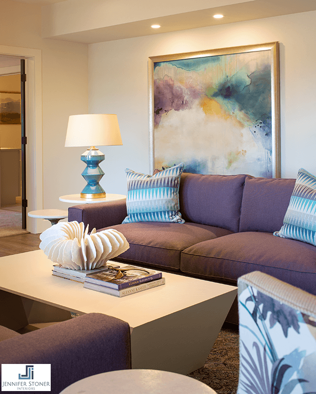
This large original artwork that we specified through one of my art dealers was the perfect showstopper for this space!
The other showstopper in this room is the travertine tile fireplace with the silver leaf finish. The tile added the needed texture and bit of metallic sheen that helped to anchor the room and create a focal point.

Another area of this basement includes a family room for playing games and watching TV. We used a commercial grade teal chenille on the sectional to withstand the wear and tear of this family.

We camouflaged a weight bearing beam at the ceiling with a curved soffit and took the opportunity to create a unique lighting effect with LED tape lighting along the perimeter. And I always love a painted ceiling, so we painted this curved ceiling a soft blue.

So like everything in life, balance is the key when incorporating color into your living spaces. You need to balance bold colors with softer neutrals to keep from overwhelming a space. Your eye needs a place to rest so that the color doesn’t all blend together and overwhelm the room.

If you love color, but you’re just too afraid to take the plunge on your own, my biggest advice is to hire a professional to help you. There is definitely an art to mastering colorful interiors and the rewards are certainly worth the investment!
